
107 Hex Codes: Why I Turned Material 3 Expressive Into an Agent Skill
I ran one command against tinyjawns, the Philly family-activities site I work on nights and weekends:
grep -rEoh "#[0-9a-fA-F]{6}\b" src --include="*.tsx" | sort -u | wc -l
107. One hundred and seven distinct hex codes, 232 occurrences, spread across 52 of my 294 component files. And that was on top of an actual, deliberate, documented token system.
Here’s the part that stung. Sorting them revealed this cluster:
#127780 #127869 #127A66 #128161 #128176 #128197 #128205
Seven near-identical teals. Plus #2A9D8F, which appears 21 times across map pins, SVG strokes, and focus rings. Meanwhile src/app/design-system/page.tsx — my own design system page — documents the brand primary as #127A66.
So my brand color was two different colors, and neither of them was winning.
The three-palette problem
None of this came from carelessness. It came from three token systems accreting on top of each other, each one perfectly reasonable at the time it was added.
/* Layer 1: shadcn/ui defaults, HSL channels, from `npx shadcn init` */
:root {
  --primary: 222.2 47.4% 11.2%;
  --muted:   210 40% 96.1%;
}

/* Layer 2: "Tinyjawns Design System v1" — 92 tokens, space-separated RGB */
:root {
  --tj-teal-50: 30 154 128;
  --tj-teal-40: 18 122 102;   /* = #127A66, the "real" primary */
}
/* Layer 3: a warm editorial palette living in tailwind.config.ts */
colors: {
  sand:   { DEFAULT: "#FAF8F5", light: "#FFFCF9" },
  canvas: { white: "#FFFFFF", ivory: "#FFFEF9" },
}
Three sources of truth. A component author — me, or an agent I’d pointed at a ticket — opens a file, sees no obvious answer to “what teal do I use here,” and picks something that looks right in the diff. Multiply by 294 files and eighteen months.
Then agentic coding turned the dial up. I could ship a feature in an afternoon instead of a weekend, which meant I was producing drift faster than I could review it. Every generated component was individually defensible and collectively incoherent.
The failure mode isn’t bad taste. It’s the absence of a written rule at the moment of the decision. An agent picking #2A9D8F isn’t wrong — it’s unsupervised. It had no way to know that #127A66 already had the job.
Why Material 3 Expressive, specifically
I didn’t want another palette. I wanted a system — something with opinions about hierarchy, depth, and motion, not just a list of colors. Three things sold me on M3 Expressive.
It’s evidence-backed, and the evidence has a warning label. Google validated the Expressive update (I/O 2025) across 46 studies and 18,000+ participants. Users spotted key UI elements up to 4× faster, and users 45+ performed on par with younger cohorts. But the same research found that expression which breaks established interaction patterns actively hurts usability. That caveat is the useful half. It reframes expression as a budget you spend, not a style you apply.
Depth without shadows. M3’s surface-container ladder (surface → surface-container-low → surface-container → surface-container-high → surface-container-highest) gives you visual layering through tone rather than stacked box-shadows. For a content-dense site full of cards, this was the single biggest legibility win.
It survives dark mode by construction. Every role token has a paired on- token with contrast guaranteed at generation time. My hand-rolled palette needed a human to remember; a generated tonal palette does not.
The web case is different from the Android case
Worth separating, because most M3 writing conflates them. On Android, Material You’s headline feature is personalization — dynamic color extracts a palette from the user’s wallpaper and the whole OS retints itself. That is genuinely the pitch, and it is genuinely not available to me. There is no wallpaper on the web. A per-user generated palette would mean my brand color stops being my brand color, which for a small site trying to be recognizable is a straight downgrade.
So I’m adopting M3 for the half that isn’t personalization: the proven-UX half. Dynamic color on web is really just seed-based theming — I run the generator once, at build time, from one brand hex, and everyone sees the same thing. What I actually bought was the research-backed part of Expressive: the hierarchy rules that made elements findable 4× faster, the tonal depth ladder, the motion physics, the contrast guarantees. Polish that someone else already validated on 18,000 people, rather than polish I’d be eyeballing at midnight.
Put bluntly: on Android, Expressive is how the OS feels like yours. On web, it’s how your product stops looking like it was assembled by six different people — which, per the 107 hex codes, it was.
The catch: @material/web is in maintenance mode and never shipped Expressive for the web. Google reassigned those engineers to their internal Wiz framework in mid-2024. So if you want M3 Expressive in React or Next.js or Tailwind, there is no library to install. You build the token layer yourself.
Which is exactly the situation a skill is good at.
Why a skill, not a component library
My first instinct was to build @tinyjawns/ui — wrap it all in components and be done. I talked myself out of it in about a day.
A component library only governs code that imports it. It has nothing to say about the 52 files already holding raw hex, about a one-off marketing page, or about the Leaflet map config where the pin color is a string in a JS object. And it fights the actual workflow: I’m not assembling components by hand anymore, I’m describing intent to an agent.
So the artifact I needed wasn’t a package. It was the rules, in a form the thing writing the code will actually read.
That’s SKILL.md — a portable instruction package a coding agent loads when it sees a UI task. It encodes six steps: establish expressive intent, build the token layer, pick the breakpoint and canonical layout, choose components, apply shape and motion, then audit.
Step 1 is the one that matters most, and it’s the one I’d have skipped if I were writing this for myself:
| Product type | Motion scheme | Expression budget |
|---|---|---|
| Consumer / media / social | Expressive | Bold color + shape; 2–3 hero moments |
| Utility / finance / enterprise | Standard | Restrained; expression only on confirmations |
| Data dashboard | Standard | Container layering for depth; 1 hero moment max |
A hero moment is one interaction that gets the full expressive treatment. You name them before you build. Without that constraint, “make it expressive” means bouncy springs on table rows, which reads as imprecision and can induce motion sickness. Expression is a dial, not a default.
The token layer comes from a generator, so the answer to “what teal” stops being a judgment call:
npx tsx scripts/generate-tokens.mjs "#6750A4" --springs > tokens.css
One seed color out, the full role set back: light and dark, the surface-container ladder, fixed roles, shape scale, and sampled linear() spring easings. It also emits explicit --app-color-success / warning / info, because M3 ships no status roles — and the tempting move, reaching for tertiary, quietly destroys your accent hierarchy the first time a success toast and a promoted CTA share a screen.
Then the rule that actually fixes my grep: every color in the app resolves to a role token; no raw hex in components. One line. It just needed to exist somewhere the author would see it.
Does it hold up?
A rules document is easy to write and easy to fool yourself about. So I tested it the way I’d test an API: same input, different clients.
I gave three models only the skill and one identical brief — build an M3 Expressive “Monthly Revenue” analytics card, seed #6750A4, light theme, fixed numbers. No other art direction.
Sonnet 5
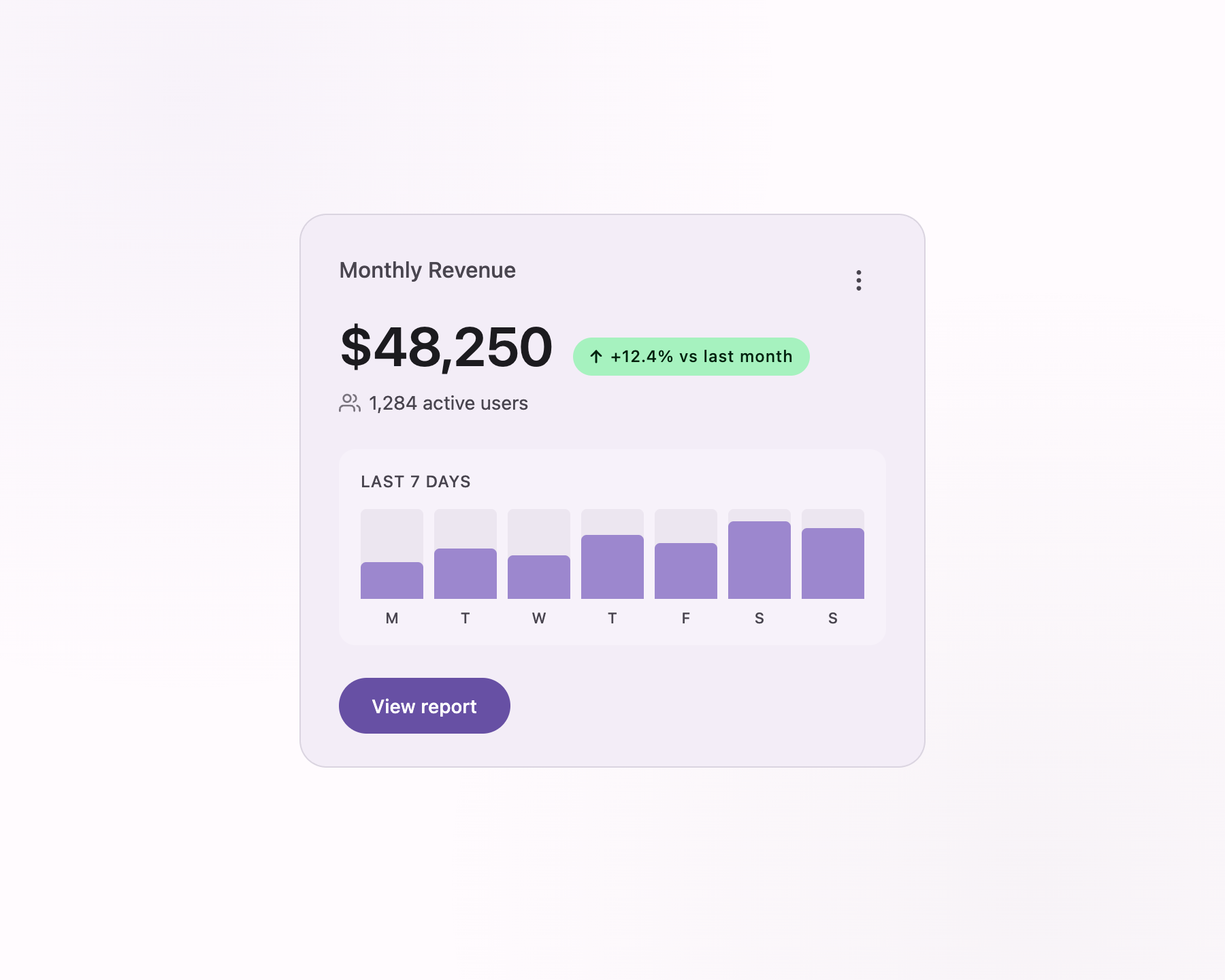
Spent the whole expression budget on the “View report” button — the only element in the primary role and the only one carrying an overshoot spring (on press it scales to 0.96 and morphs its corner from pill to 14px). The positive delta pairs a custom success token with an up-arrow, so it never encodes on color alone.
Opus 4.8

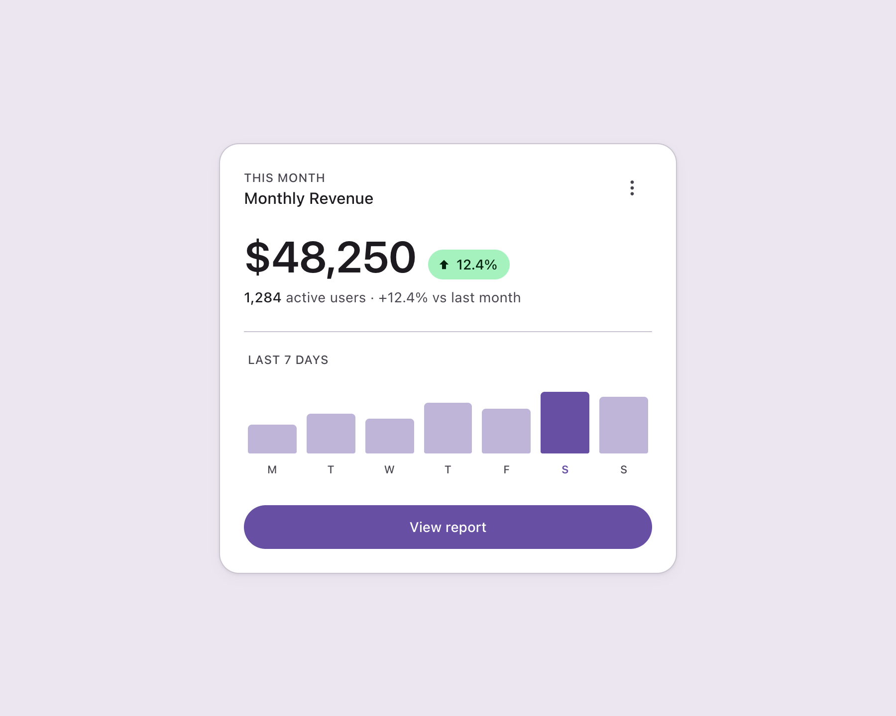
Put the hero on the $48,250 metric at Display Medium and left everything else on baseline type, so the squint test passes. Depth is pure container ladder — no shadows — and exactly one bar in the seven-bar chart is pulled to full primary.
GPT-5.4, via Codex
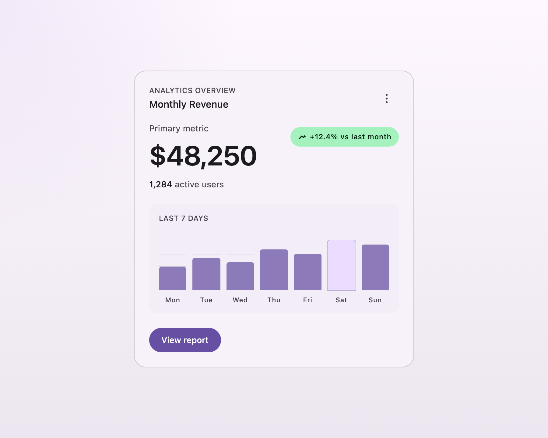
A non-Claude agent reading the same file, landing the same fundamentals: shadowless ladder depth, metric as hero, a single pill button carrying the only primary accent, restrained Standard motion. It was the only one to draw gridlines behind the bars.
Three different aesthetic outcomes. Zero disagreements on hierarchy, depth, contrast, or motion restraint. That’s the whole thesis — the skill doesn’t dictate taste, it eliminates the drift, and what’s left over is design judgment worth having.
Then I pointed it at my actual site
Clean-room cards prove the rules are coherent. They don’t prove the rules survive contact with eighteen months of accreted CSS. So I checked out tinyjawns main into a worktree and ran the skill against the real /explore page.
Before — the live page as it ships today:

Count the brand teal: three “Free” badges, plus the nav CTA off-screen. Cards have no boundary — the images just float on the cream canvas, so the grid reads as a wall of photos rather than a set of discrete objects. Corner radii disagree (image rounded-lg, badge rounded-lg with a shadow, chips rounded-full). And the price badges use a shadow-sm to lift off the image, which is exactly the depth mechanic M3 replaces.
After — same page, same data, six files changed:
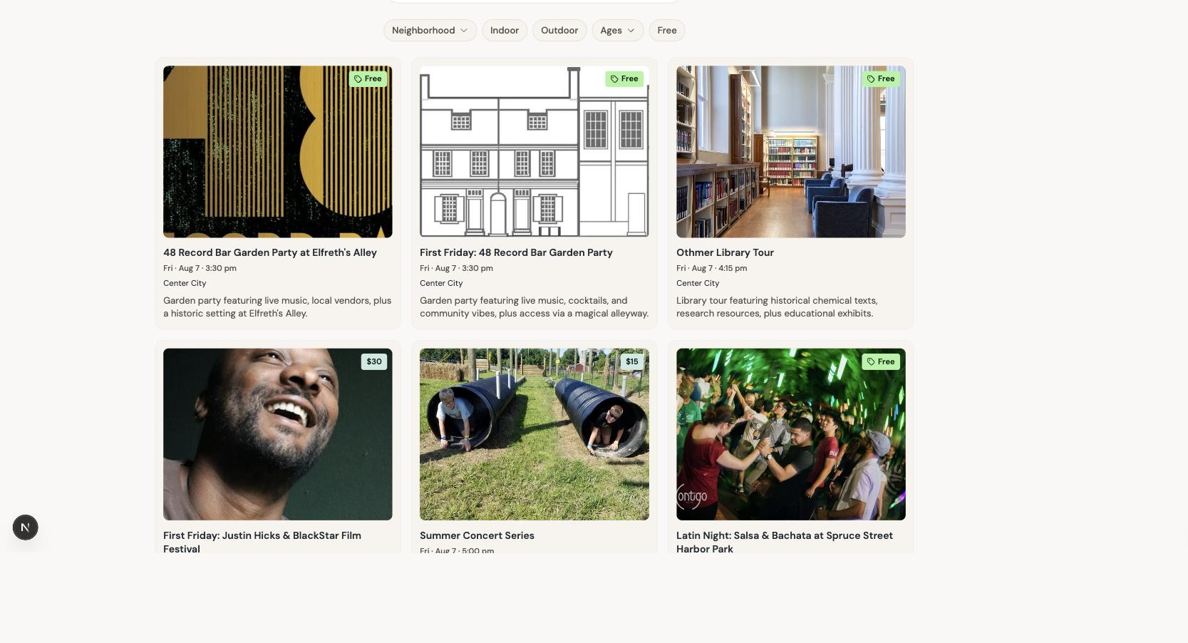
Cards now sit one rung up the ladder (surface-container-low) from the page canvas (surface), with an outline-variant hairline. That’s the entire depth mechanism — no shadows. “Free” moved off brand teal onto the custom success token and picked up a tag glyph, so it no longer competes with the real CTA and no longer encodes on color alone. Prices take secondary-container. Corner rhythm is now one scale: card 12px, image 8px, badge 4px, chips full.
The whole diff:
 src/app/explore/page.tsx                  |  2 +-
 src/app/globals.css                       |  4 ++
 src/components/explore/ExploreCard.tsx    | 86 +++++++++++++++++-----
 src/components/explore/ExploreFilters.tsx | 15 ++--
 src/components/explore/ExploreGrid.tsx    | 10 +--
 tailwind.config.ts                        | 35 ++++++++++
 6 files changed, 121 insertions(+), 31 deletions(-)
Plus 220 lines of generated token layer that no human wrote.
The most useful thing that happened was a failure. My first pass imported the generated tokens as-is and the page turned cold. M3 derives its neutral ramp from the seed hue, and a teal seed yields gray-green surfaces. TinyJawns is warm cream paper. The nav stayed warm, the grid went gray, and the seam between them was ugly:
/* what the generator produced */
--md-sys-color-surface: #f8faf7;              /* cool, seed-derived */
--md-sys-color-surface-container-low: #f2f4f1;

/* what the brand actually is */
--md-sys-color-surface: #faf8f5;              /* warm paper */
--md-sys-color-surface-container-low: #f7f3ed;
The fix was a 55-line override file that re-tones only the neutrals and leaves every accent role exactly as generated. Kept in a separate file from the generator output, so regenerating never clobbers it.
That’s the honest shape of adopting a design system into an existing product: you inherit the structure, not the palette. The ladder, the on- pairings, the shape scale, the motion rules — those are the reusable part. The specific neutrals were never the point, and a skill that insisted on them would just be a different flavor of the same problem I started with.
Three smaller things fell out of doing it for real, and all three were silent.
The shape scale didn’t apply at all on my first build, and I didn’t notice until someone told me the cards looked square. The skill’s Tailwind mapping tells you to add a borderRadius block. My config already had one — shadcn’s, three keys, four hundred lines down. Two borderRadius keys in the same object literal is not an error in JavaScript. The last one wins, mine lost, and every rounded-md3-* class I’d written silently generated nothing:
theme: { extend: {
  borderRadius: { 'md3-md': '12px', ... },   // ← mine, silently discarded
  colors: { /* ~120 lines */ },
  borderRadius: { lg: 'var(--radius)', ... }, // ← shadcn's, wins
}}
Tailwind emits no warning for an unknown utility. The page renders, the class does nothing, corners go to zero. The fix was merging into the existing block instead of adding a second one — and the general lesson is that a skill telling an agent to “add a key to your Tailwind config” is telling it to do something that can silently destroy adjacent config. That instruction needs to say merge, and the audit checklist needs a line that verifies a generated utility actually resolves.
The other two: the generator emits --md-sys-color-surface twice with different values (harmless, the second wins, but I’d never have found it reading the script). And the generated dark block is scoped to [data-theme="dark"] while TinyJawns’ Tailwind uses the .dark class strategy, so dark mode silently wouldn’t have switched. The skill’s reference doc mentions both strategies; it doesn’t make you pick one. It will now.
And because motion is contextual, the dashboards deliberately stay on the restrained Standard scheme while a FAB menu — a genuine hero interaction — earns the bouncy Expressive one:
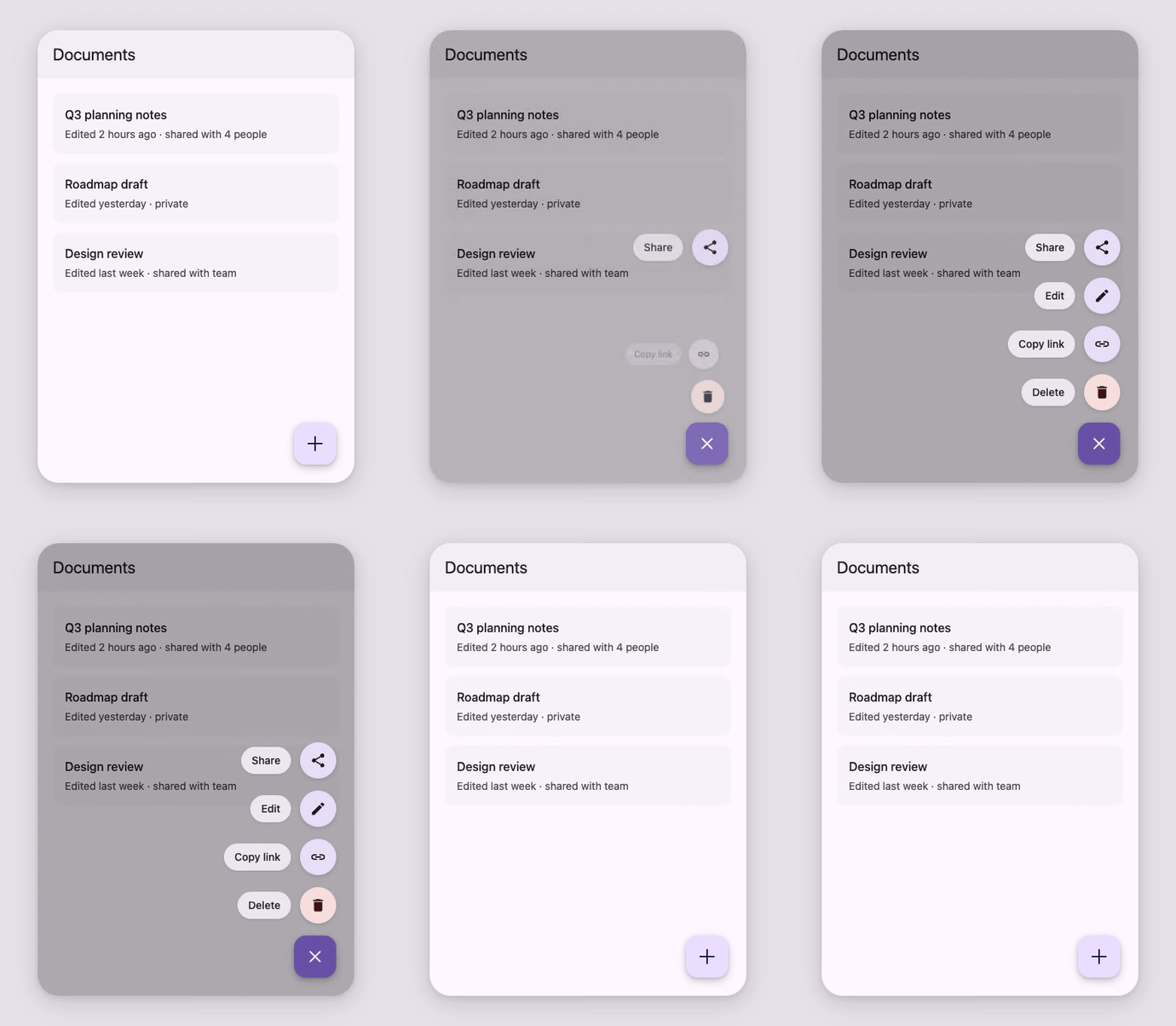
Four actions on the Expressive spatial-fast spring — cubic-bezier(0.42, 1.67, 0.21, 0.9), where the 1.67 control point is the overshoot — staggered 30ms nearest-first, while the label pills fade on a critically-damped effects spring that never overshoots. The + morphs to × on the same curve. Every spatial curve flattens under prefers-reduced-motion.
Both clips are recorded from real HTML with Puppeteer. CSS-only checkbox toggle, no JavaScript.
What I’d do differently
The audit step should have come first. Step 6 is an eight-point checklist — role tokens only, contrast on on- pairs, no color-only encoding in data viz, ≥48dp touch targets, primary on at most one action per view. I wrote it as a finishing move. In practice it’s the highest-value part of the whole skill, because it works standalone against code that was never built with M3 in mind. If I were starting over I’d have shipped the checklist alone and added the build workflow after.
One page is not 52 files. Full disclosure on scope: /explore is migrated, on a branch, and the other 51 files still hold their share of the 107 hex codes. The remaining work isn’t mechanical — it’s judgment calls about which teal was supposed to be the brand one, and some of those answers are genuinely lost. What changed is that the work is now tractable: I can hand an agent a file plus a rule instead of a file plus a vibe. Tractable isn’t done.
The real lesson generalizes past Material. Agents don’t have your design system in their weights. They have a design system in their weights, averaged over every site on the internet, and it will confidently produce something plausible every single time. The fix isn’t better prompting per task. It’s writing the rules down once, in a file the agent loads before it starts.
I had a design system. What I didn’t have was a design system anything could read.
The skill is on GitHub at brh55/m3-expressive-web-skill — portable SKILL.md format, so it works in Claude Code (cp -R m3-expressive ~/.claude/skills/), on claude.ai, or pointed at Codex. The examples above are all in examples/ with source HTML, if you want to check my work.